


MathemaTIC
Logo | Branding | Web & UI/UX Design | Production
Photo Editing | Typography | Copy Writing
Art Direction | Print


 Case Study
MathemaTIC
Online Education
Personalized Learning in mathematics
https://www.mathematic.org/
Project Description
MathemaTIC is a personalized learning platform for students to engage with, and have fun learning math in primary and secondary schools. Students work through interactive mathematical items and are provided with adaptive scaffolding to activate prior knowledge by using several learning strategies which lead to adaptive help-seeking. It is a product line of “Vretta” (an e - learning organization). They partnered with the education ministry of Luxembourg to create each lesson, game, assessment, platform, systems etc. Since then, they have incorporated the MathemaTIC products to the education system of Portugal, Germany, France and counting.
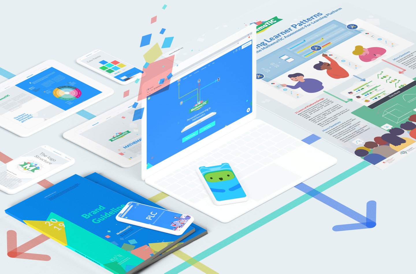
This project had many different elements so we have decided to split it into two parts for the sake of presentation. This case study showcases primarily the Branding and Web Design/ Development side of the project, whereas part 2 displays Product Design/ App Development and Game Design.
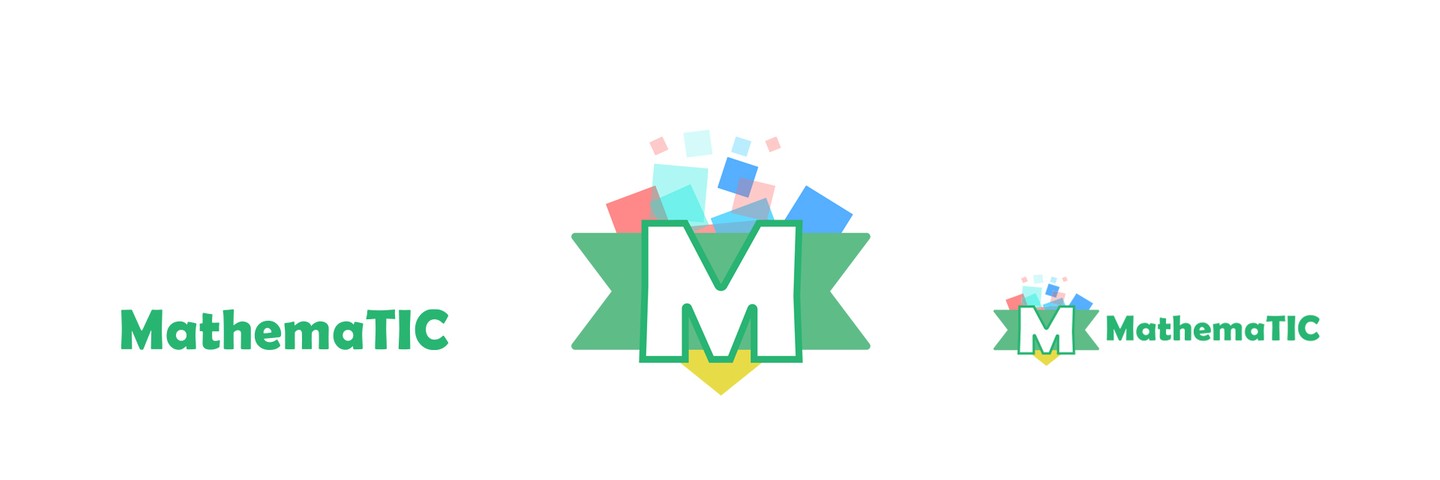
The MathemaTIC products have quite a few linear levels of users. From education ministers, to teachers, to parents, and lastly and most importantly; students (from ages 6-14). Therefore the main emphasis of the brand is “fun” enveloped by an educational tone, creating a balance for all users. Also being a product of Vretta, and Luxembourg Ministry, it was quite fun and challenging to incorporate both of their essence into the brand and website.
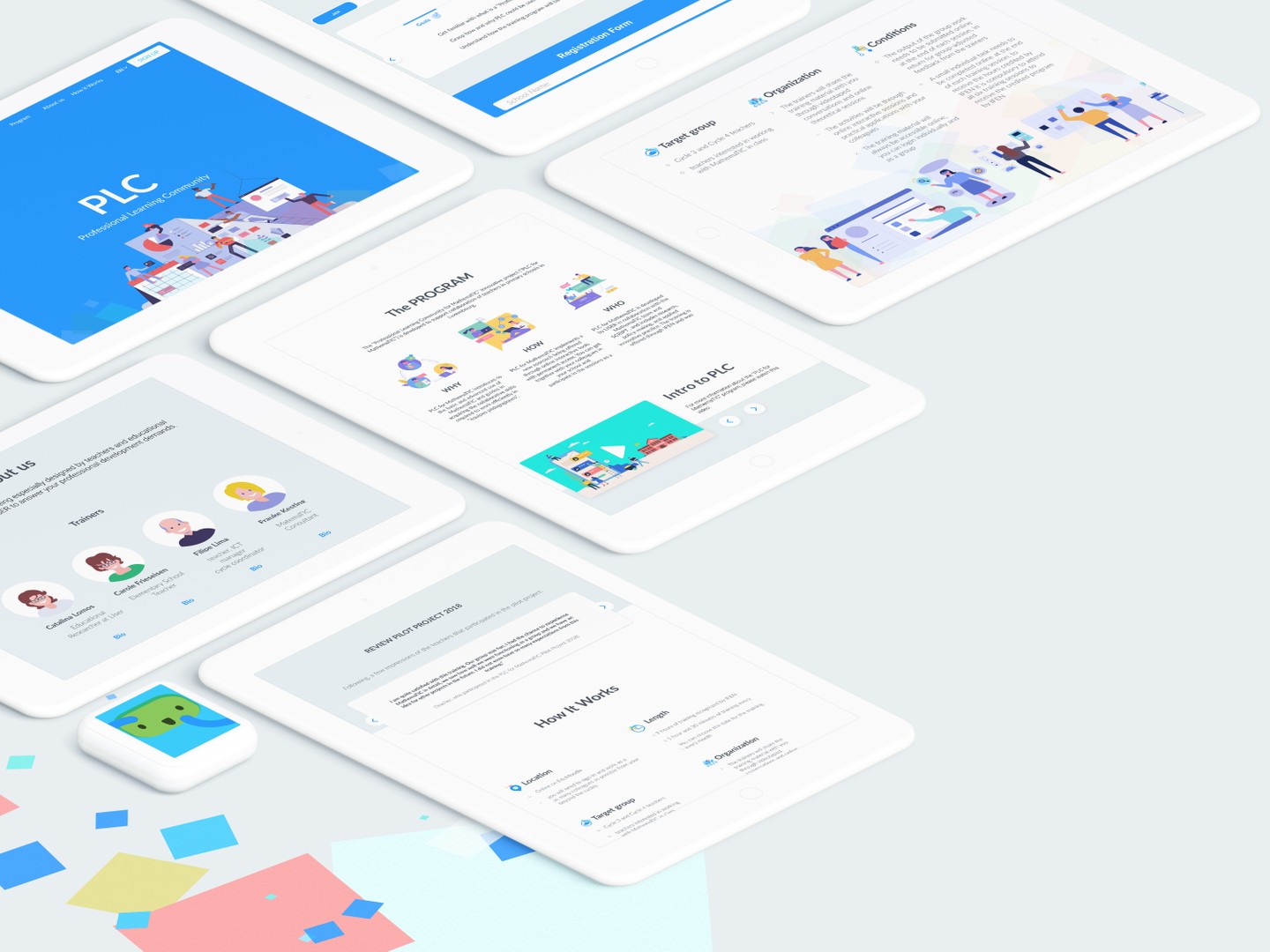
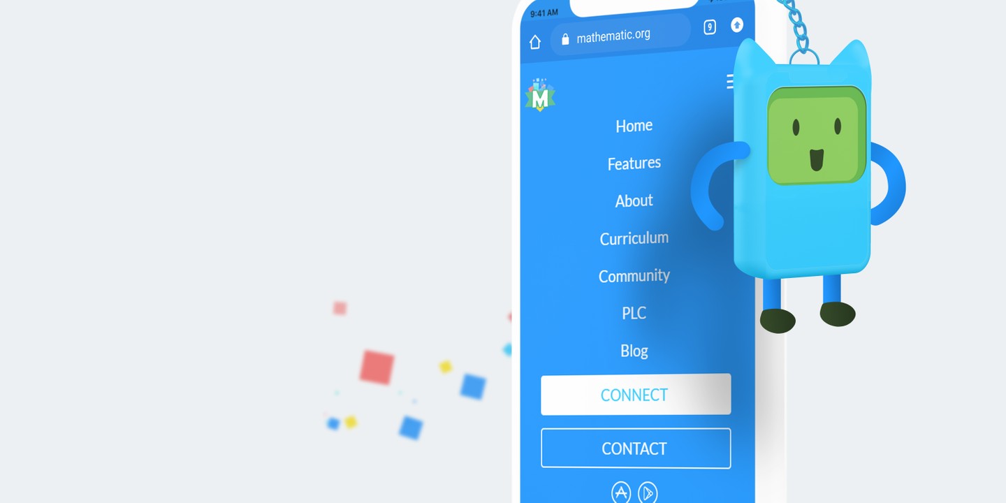
The MathemaTIC Website is primarily a marketing website, however it needed to be coupled with a heavy dose of information. It was exciting to find creative ways to blend typography with layout, and subtle animation to keep the content fresh for serious users, and easy to skim through for casual viewers. The site is also multilingual, currently in 4 languages, and even if new languages were added with longer than usual wording, the design of the site shouldn’t falter. It is designed with a sense of direction, whenever a natural stop occurs there is always a callout to another section or a “learn more”, or leading to the Login/ Signup for the Platform.
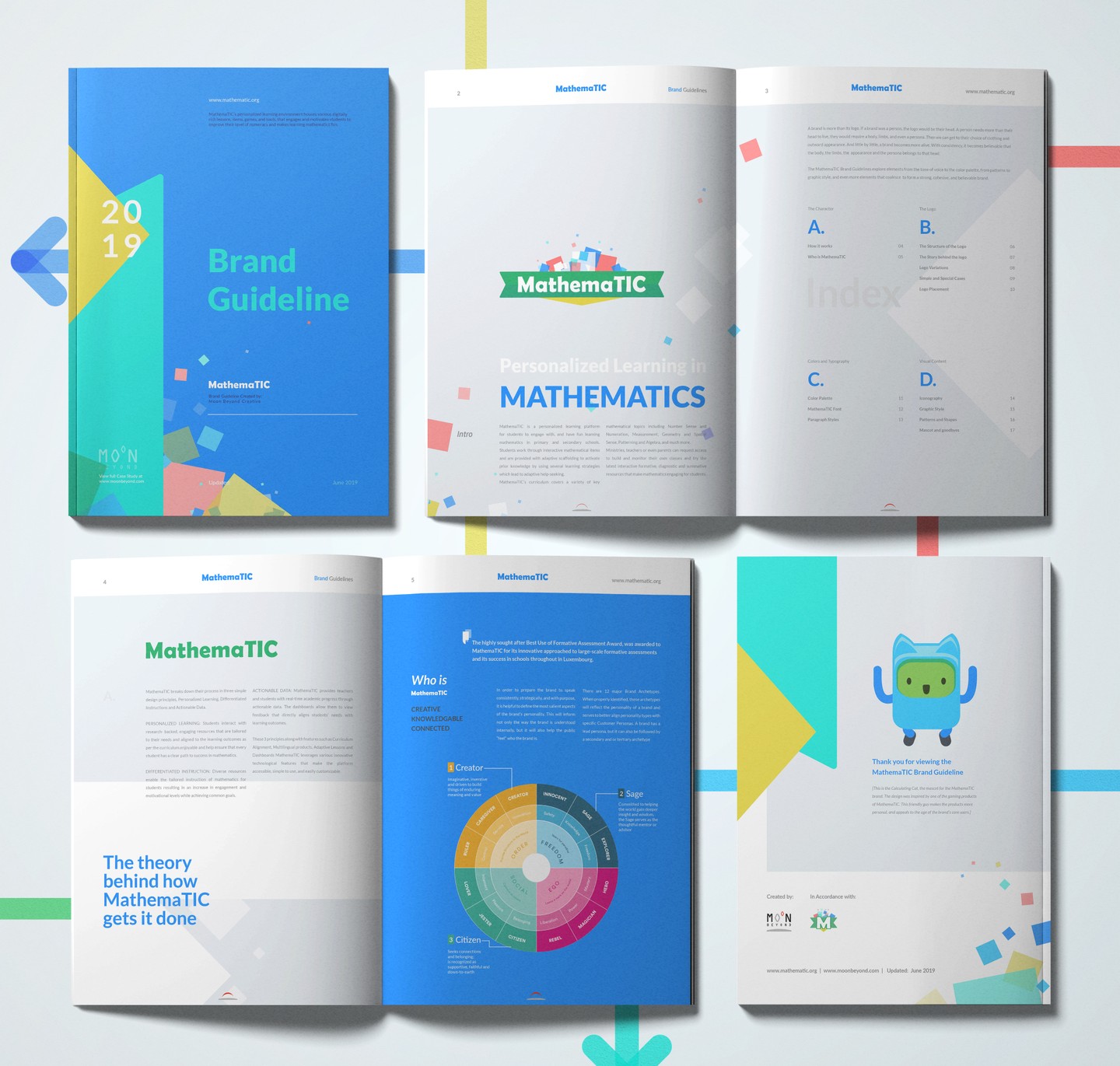
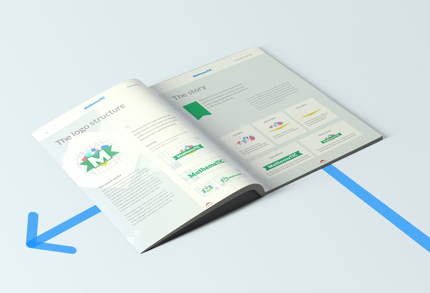
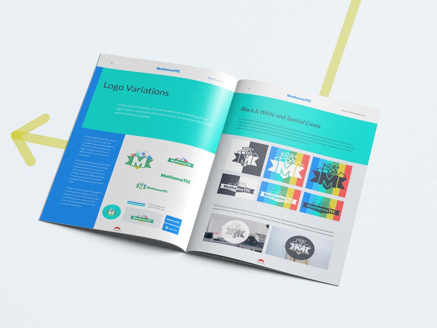
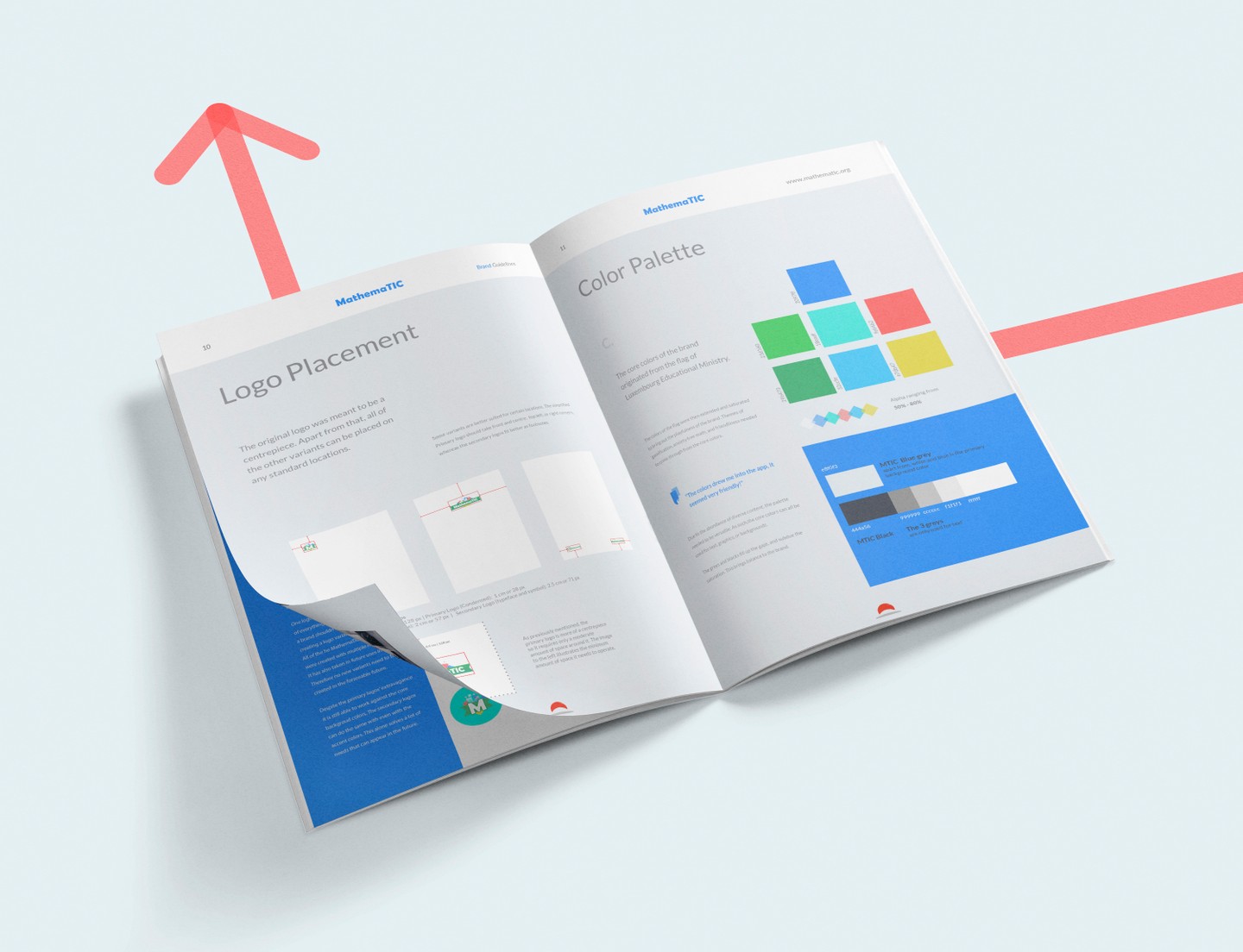
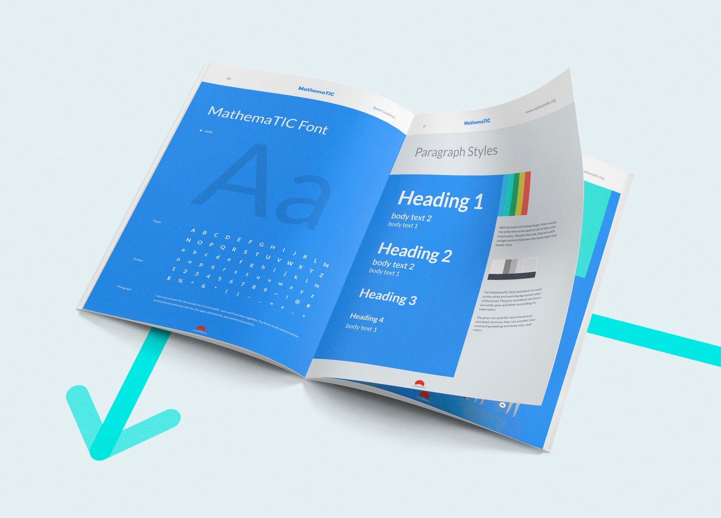
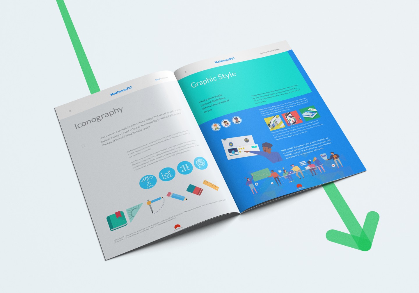
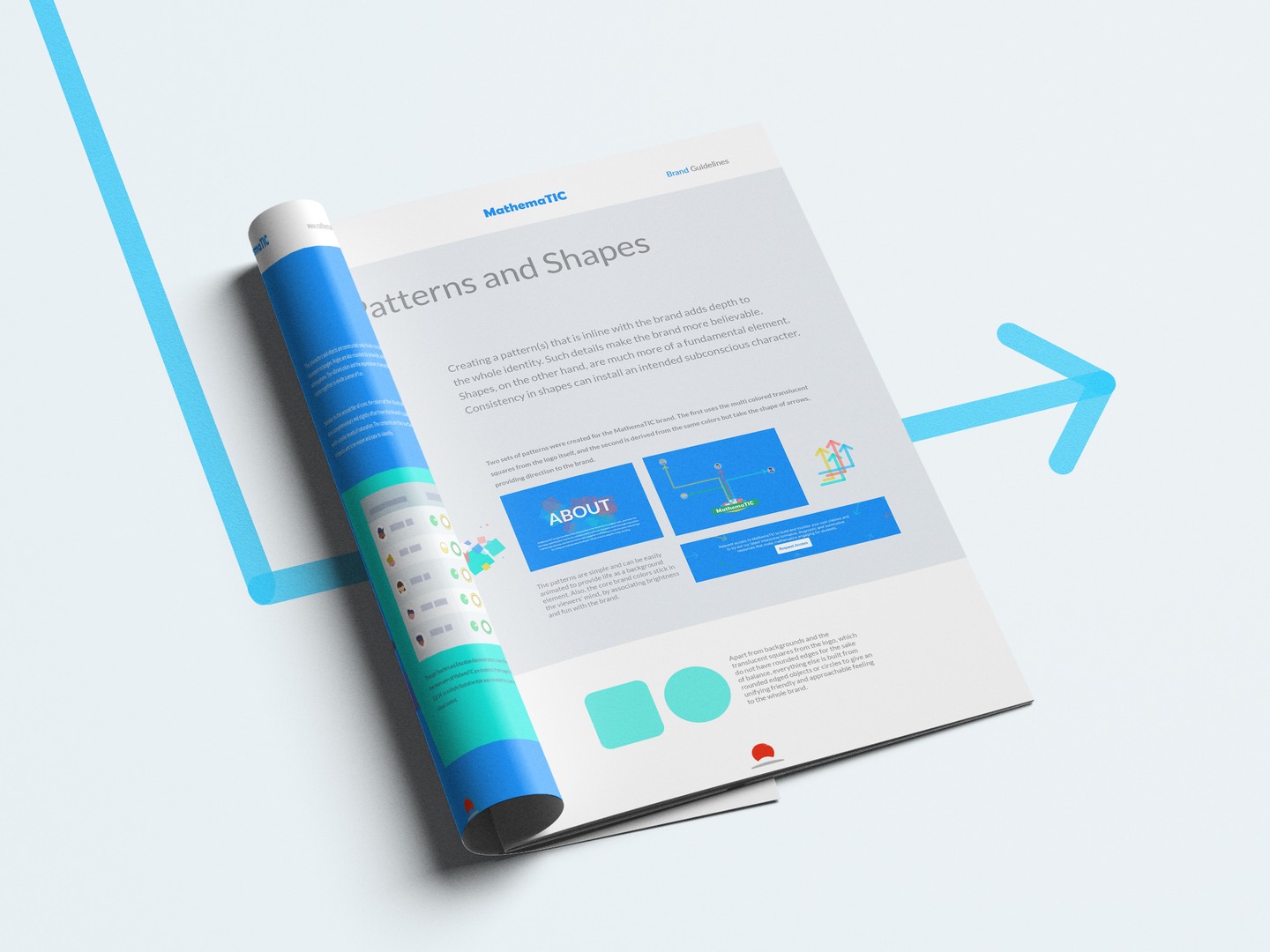
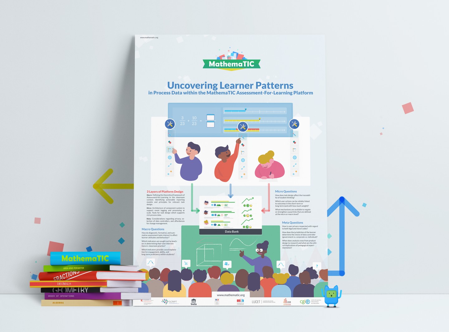
With the creation of the MathemaTIC brand guidebook, when the time came to create marketing collateral such as: brochures, flyers, posters etc; visually all we had to think of was the layout. The paragraph styles and grid breakdown, graphic and illustration styles, patterns and positioning had all been taken care of during the branding phase.
It’s always a pleasure to work on cases like this, where we have various heavy duty elements, and we bring them all together, to create a cohesive, engaging story. Looking forward to more projects like this, stay tuned for part 2!
Designed by Moon Beyond Creative