


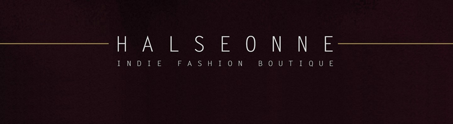
Halseonne
Logo | Branding | Naming | Marketing | Labeling | Signage
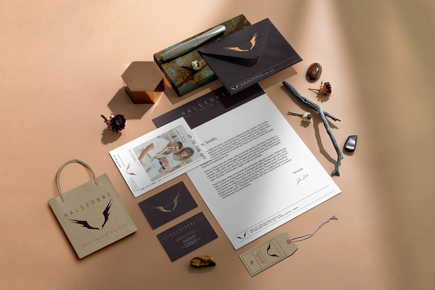
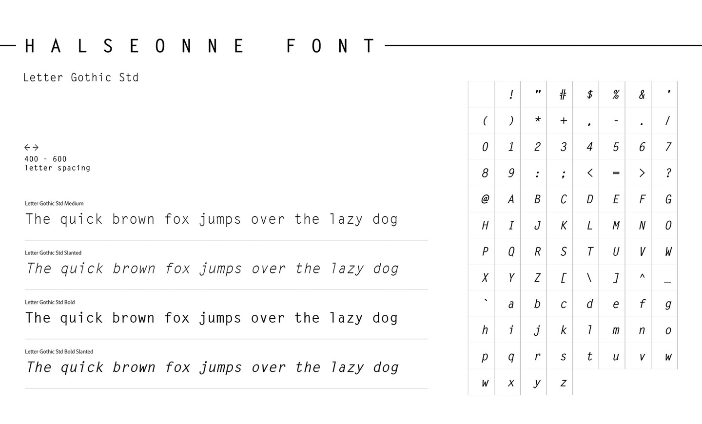
Packaging | Print & Stationery Design | Photo Editing | Typography
Production | Copy Writing | Art Direction

 Case Study
Halseonne
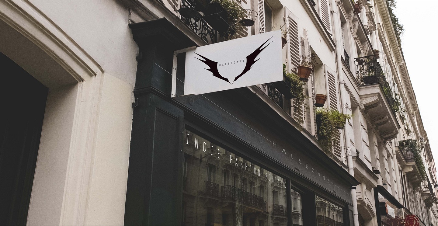
Indie Fashion Boutique
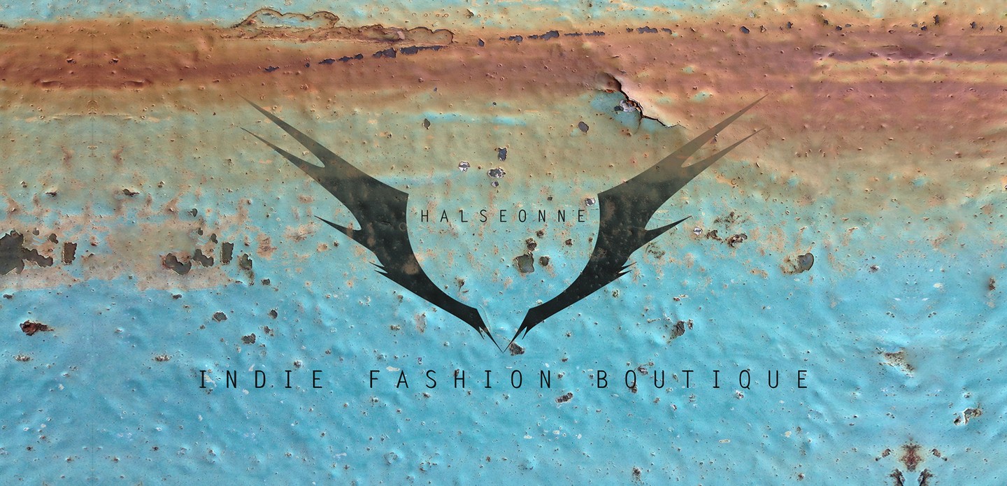
"The Wings Of Style"
Project Description
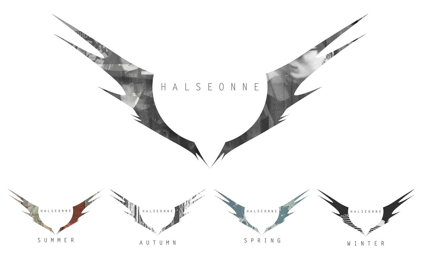
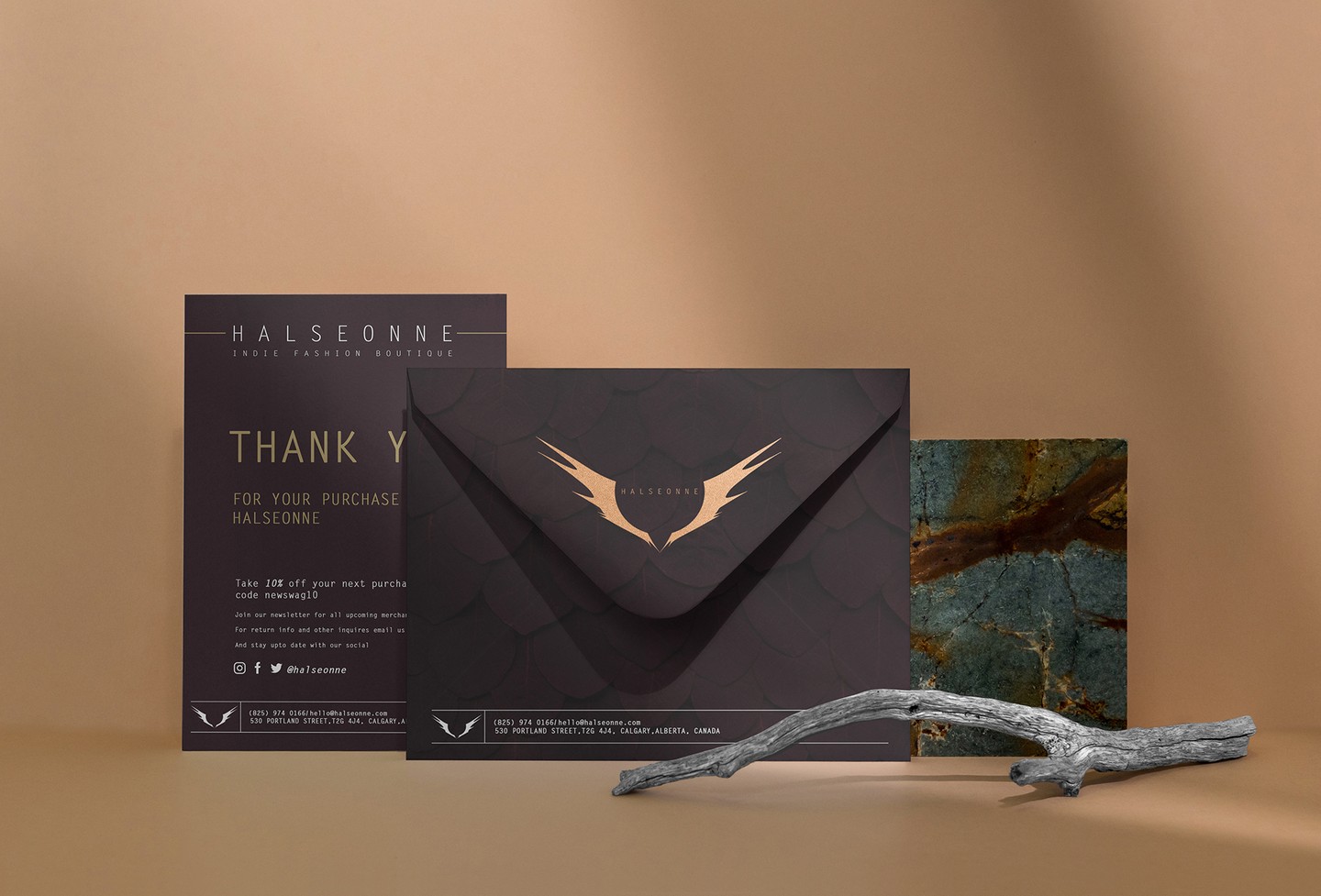
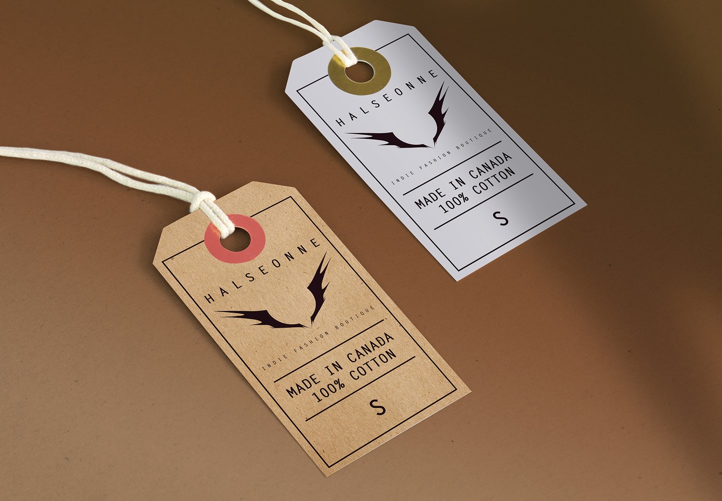
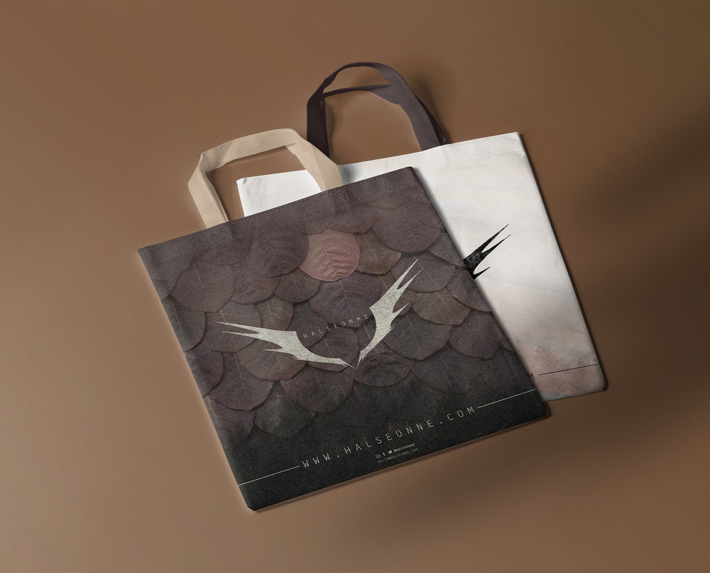
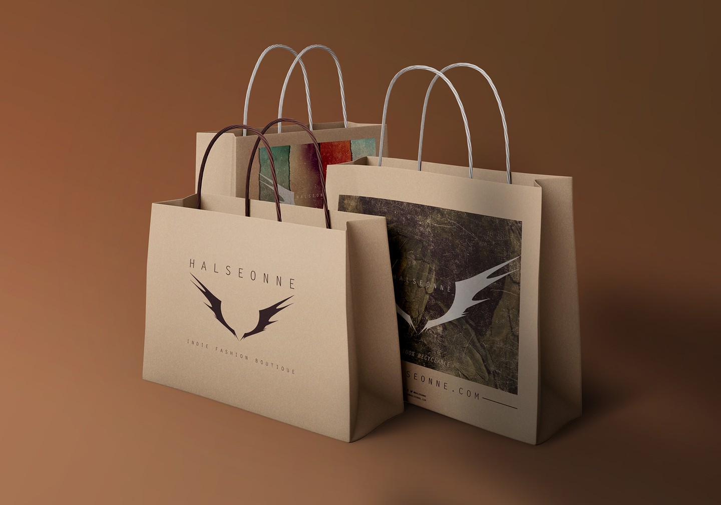
Halseonne is an indie fashion boutique that carries high end products for urban tastes. A brand with a distinct edge and style; we found it to be a fun challenge to match their alternative attitude with an equally slick Naming and Branding. Once we created the the name Halseonne, we wanted to shine its story through our designs.
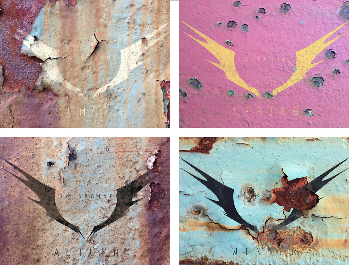
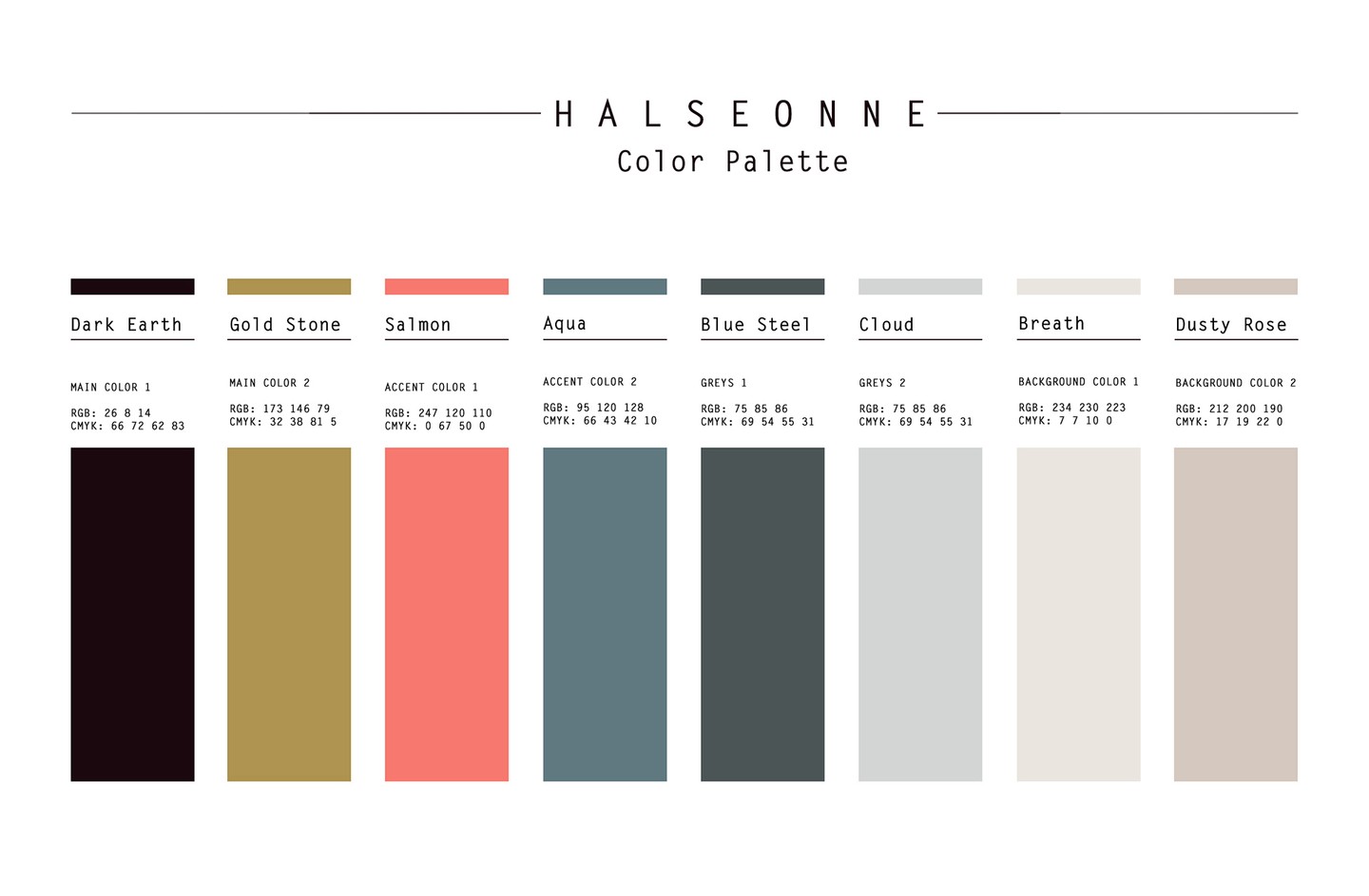
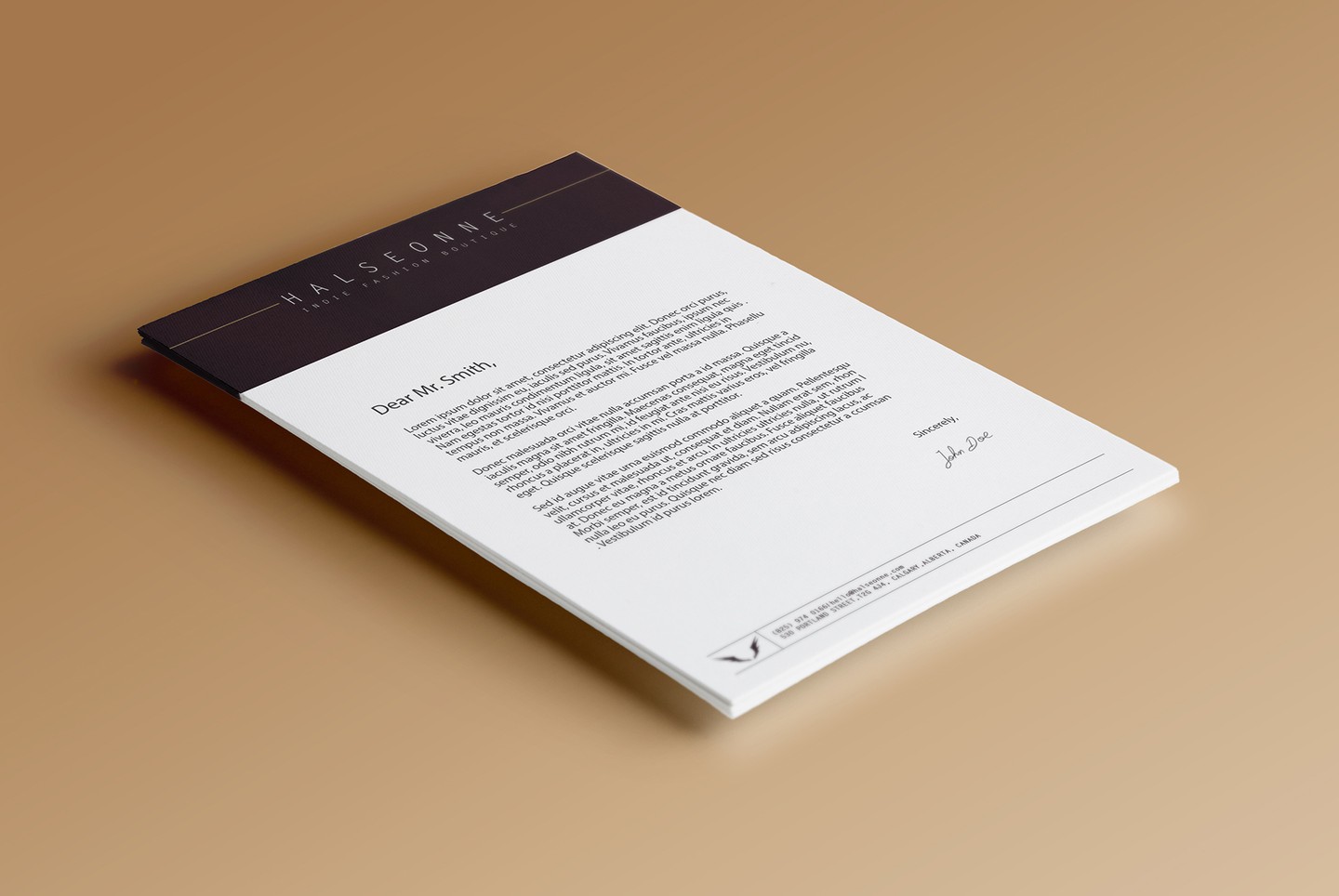
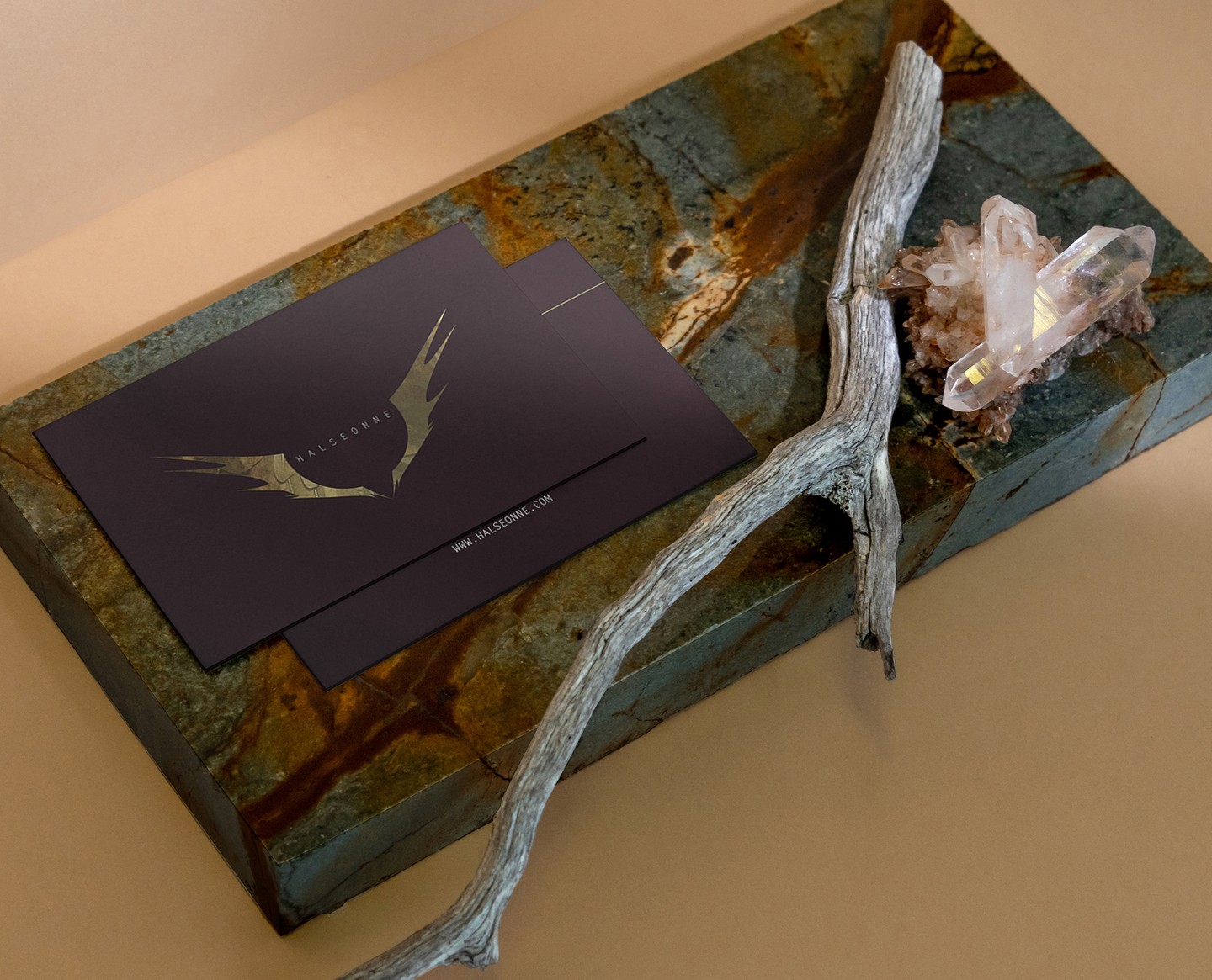
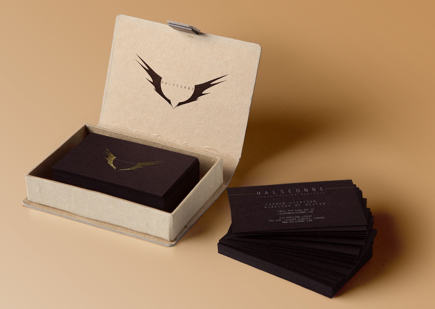
Coming from the word ‘halcyon’ meaning peace and tranquillity and also the name of a type of kingfisher we wanted Halseonne’s double meaning to be represented by both the colours and the logo. The muddy brown of the background keeps the brand grounded while the wings found in its logo keep it afloat. The different textures show off an edginess and roughness of the brands rock star sensibility and rebelliousness. We were also able to promote the brand and re style the logo through various seasons. Taking a different note on the same design and still keeping it new and fresh was an unique challenge, and we were able to learn a great deal from it.
Designed by Moon Beyond Creative