Lotus Herring
Logo | Naming | Branding | Web & UI/UX Design | Marketing
Labeling | Print & Stationery Design | Photography & Photo Editing | Typography
Packaging | Copy Writing | Social Media Content | Art Direction
Lotus Herring
Designer Fashion Brand
"Know Your Flow"
www.lotusherring.com
Project Description
Lotus Herring is a clothing company starting from the ground up with fresh and new ideas for fashion. It was a joy working with them and finding out that we had a lot in common. Targeting young, city dwelling professionals they wanted a clean and balanced look that could appeal to both masculine and feminine tastes.
We created the name Lotus Herring, which plays with the idea of water, and we knew we wanted to show that in two ways. We used cool green shades to show calmness of a pond filled with lotuses, and a salmon (or a red herring if you will) tone to remind their audience of the living energy, that travels through a flowing river. The choice of colour also captures the different sexes the company wants to appeal to and it was important that they could work well together. The story of Lotus Herring will take you where you need to go, but keep you where you need to stay.
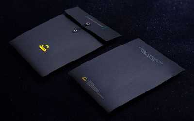
The chic style in the logo design was a fun project that we were very happy about. It purveys a cleanness and modernness suited for a young professional. We made sure to utilize different textures when it came to the design to appeal to popular youth culture. From there we were able to create a variety of content and design, from their Online store to packaging, and brought everything together in an unified and complete fashion.
Designed by Moon Beyond Creative

